Answers:
a) Please check the images below.
b) No.
Step-by-step explanation:
Hi,
A histogram resembles a bar chart but bins numbers into intervals.
The weights data signifies:
Range = Maximum Value - Minimum Value
= 69 - 36
= 33
Required classes are 8.

As we construct our data with this width, it will leave a few values out; hence, we slightly adjust the max and min values to ensure all values fit into the range.
Approximate max = 71
Approximate min = 35
New range = 71 - 35
= 36

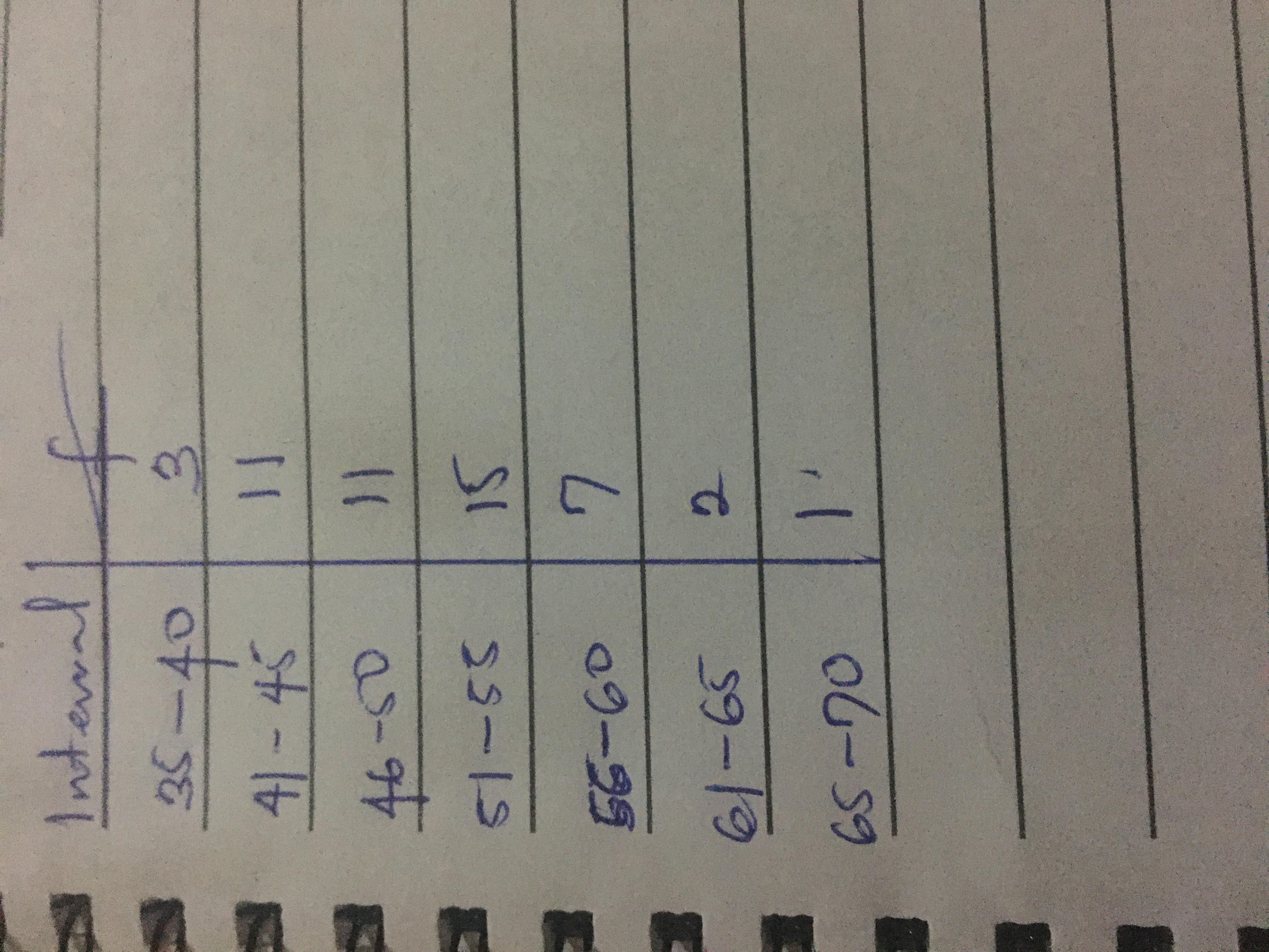
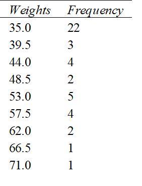
Based on this, we formulate our frequency table:
Starting from 35, we add 4.5 to reach 39.5.
The next value is obtained by adding another 4.5 to 39.5, making it 44.0.
This continues until all classes are established:
35.0 - 39.5
39.5 - 44.0
44.0 - 48.5
48.5 - 53.0
53.0 - 57.5
57.5 - 62.0
62.0 - 66.5
66.5 - 71.0
With each class width, count how many values fall within those intervals to establish the frequency count.
The final table appears as displayed in the accompanying image below.
To build a histogram, plot the class intervals (x-axis) against the frequency (y-axis). The histogram will resemble the image below.
b)
A close inspection of the table indicates that frequencies are skewed more towards the left. Thus, we characterize this distribution as left-skewed.
Additionally, it can be inferred that the mean and other central values are pushed more towards the left side of the graph.
Hence, the claim that their metal rings weigh around 50 ounces seems unfounded as central values are predominantly left-skewed.